
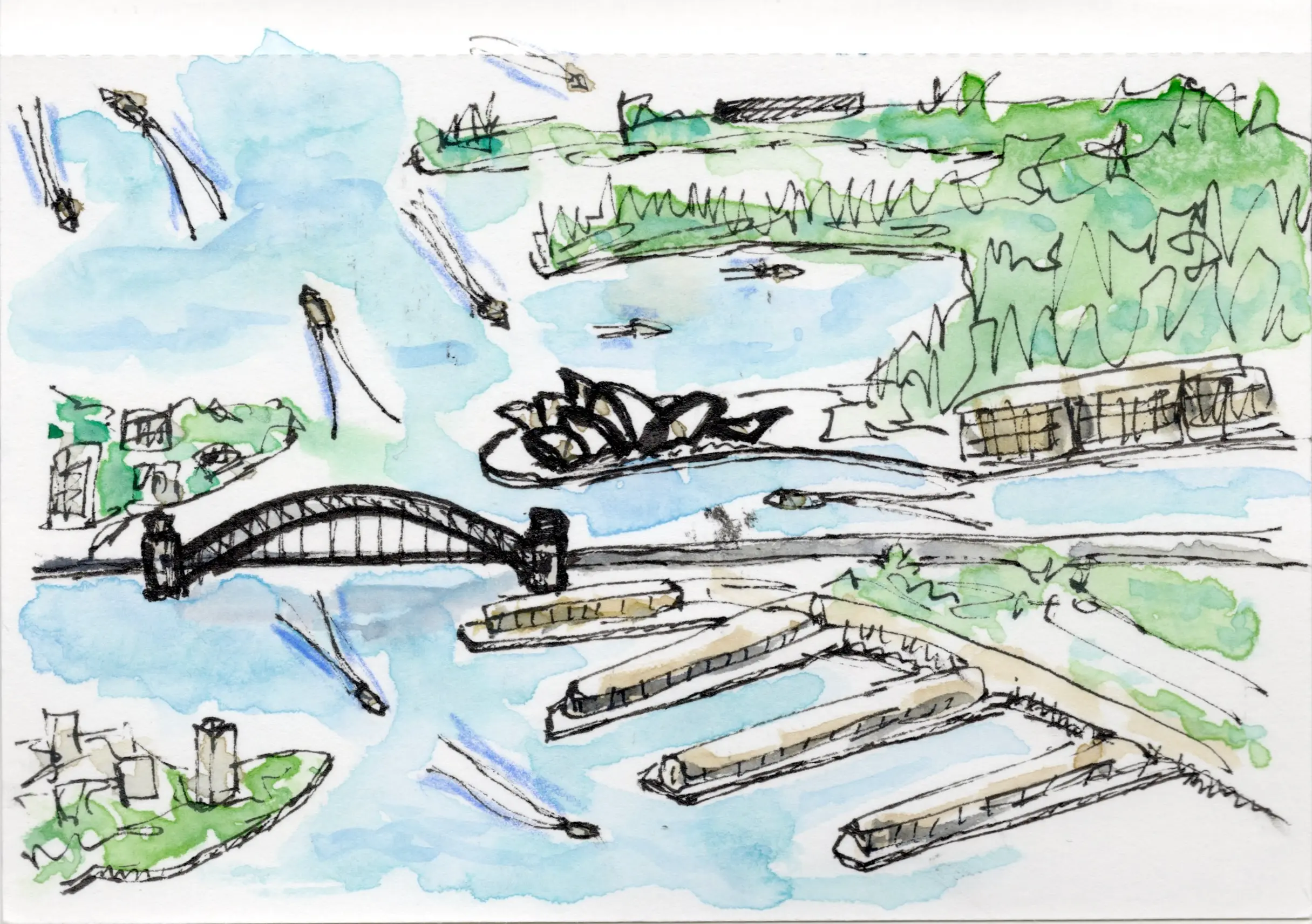
On a recent trip to Boston, I did as much sketching as possible. I sketched on planes. I sketched in hotel rooms.
I travel light, so to keep my kit small, I only brought my watercolour palette, a small selection of watercolour pencils, and a couple of pens. I sketched in my Traveler’s Notebook, which I carry around all the time anyway, using the watercolour paper insert.
I love the process of recording what I see through ink and watercolour. But when it comes to urban sketching, as is common with learning any new skill, my taste exceeds my abilities. I look at the work of other urban sketchers with envy, wishing my finished product looked as good as theirs.
But all I can do is work to improve, step by step. I need to look at my own work critically, determine what can be improved, and then weave that into my practice for next time.
I took a lot of photos while I was walking around, and I usually sketched from those photos. When I wasn’t happy with a sketch, I repeated the same sketch, making some changes to try to improve it.
Through sketching, looking critically, and iterating, I’m learning a few important lessons about my sketching practice:
Composition
Rather than just going in ink-first, I’ve been lightly pencilling in broad shapes first. That helps me nail the composition and proportions while I can still easily erase. I try not to do too much with pencil. Just focus on the shapes and proportions.
I’ve also been working on simplifying my compositions. A sketch is usually more successful when there is a definite focal point, and just a few surrounding elements.
Colour
A big lesson for me has been to hold back on colour. It’s tempting to want to reproduce each colour I see, but that doesn’t usually lead to a harmonious sketch. Instead, I focus on values (shadows, midtones, highlights) and keep the palette simple.
A tip I picked up from a video somewhere is to use a colour in multiple places in the composition. If I use a colour in just one corner of the sketch, it looks imbalanced unless I add some of that colour to the other side.

Creating contrast
The surrounding world is saturated with colour. But I’ve been learning to leave a decent amount of white space in any sketch. This can be challenging with watercolour, because white space means no colour. I need to plan these white areas in advance and ensure I hold off on painting there altogether.
On the flip side, I also need to make sure there’s enough black in the sketch to provide contrast. Since I use black ink to create outlines and shadows, this isn’t usually an issue. But I’ve noticed that sketches with a good balance of white and black feel more successful.

Creating interest
Once I’ve decided on my focus area, I try to use details to define the focus layer. That means adding more details to those areas, to draw focus, and leaving other layers very sketchy.
I’ve also been experimenting with adding tiny people (thanks to the amazing Sneaky Artist!), which adds life, scale, and context to a sketch.

Looking critically
Once I’ve completed a sketch, I look at it critically. I usually have a gut reaction to what I’ve done, but then I interrogate that further. What do I like? Does it have a good composition, a good level of detail? What don’t I like? Does it lack contrast or a focal point?
I’m not above redoing a sketch that doesn’t feel as successful. That’s a great way to discover which choices make a difference to the overall sketch.
Here are two sketches I wasn’t happy with, so I did a second version (drag the slider to see the before and after). The second version has less colour, and more white. Both have been improved, but there’s still a lot further I could take them.


Finding my own way
I read a lot of books and newsletters, watch a lot of tutorial videos, and look at a lot of sketchers’ work. This is all very inspiring, but there’s no comparison for just practicing over and over to figure out what materials and techniques feel the best to me.
I’ve realised that my style is like my signature. It’s made up of all my inspirations, experiences, and tastes. It won’t look like anybody else’s, and it shouldn’t.
I have a long way to go to make my skills live up to my vision. But I continue to work on my sketching, practice as much as possible, and be honest about what I can improve.
I’m enjoying the journey.

Leave a Reply to SAYOR BASELENOUSCancel reply